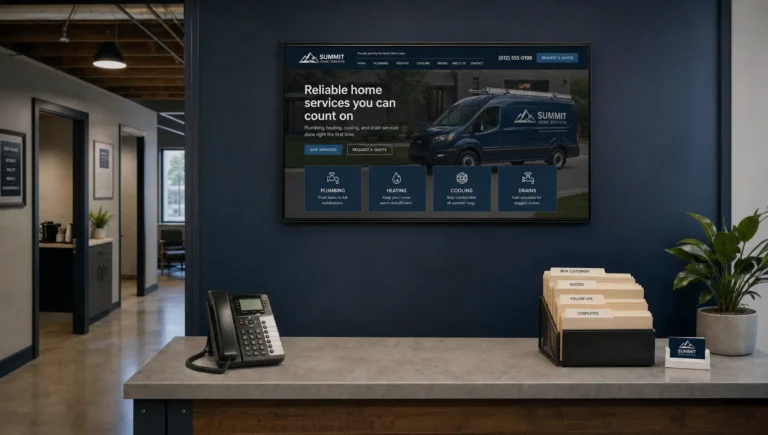
Navigation is not decoration. For a local service business, it is the path a visitor follows before they call, book or request a quote. Strong small business website navigation helps people understand what you do, where you work and why they should trust you without making them hunt for answers.
If your website gets visits but not enough leads, the problem may not be your logo, colors or homepage photo. It may be that visitors cannot find the right service page fast enough, do not see a clear next step or get lost in a menu built around your company instead of their problem.
Why Website Navigation Directly Affects Leads
Most visitors arrive with a task in mind. They need a plumber near them, a contractor who handles a specific job, a driving school with open lesson times or a nonprofit they can contact quickly. They are not there to admire your web design. They want confidence and a clear next step.
Good navigation reduces friction. It tells visitors where to go, what matters most and how to take action. Poor navigation creates small moments of doubt. A confusing dropdown, hidden phone number or vague menu label can be enough to push a visitor back to Google.
This matters even more for service businesses because customers are often comparing several local options at once. If your competitor makes it easier to find pricing guidance, service areas, reviews or a contact form, they may win the lead even if your business is better.
Navigation also affects how search engines understand your site. When your most important services are easy to reach from the main menu and linked clearly across the site, Google has a better chance of finding and understanding those pages.
Small Business Website Navigation Starts With Buyer Intent
The best small business website navigation is built around what customers are trying to do, not how your business talks internally. A visitor does not usually care about your department names, company timeline or every minor page on the site. They care whether you solve their problem.
A simple way to plan your navigation is to write down the questions a serious prospect has before contacting you. For a local service business, those questions are usually predictable.
What visitors need to confirm quickly
Visitors want to know if you offer the service they need, serve their location, look trustworthy and make it easy to contact you. Those four points should shape the top-level menu.
A driving school visitor may need to find lesson packages, instructor information, service areas and an online booking page. A contractor visitor may need project types, before and after examples, insurance information, reviews and a quote request button. The labels change by industry, but the job of the navigation stays the same.
If a menu item does not help a visitor move closer to a decision, it probably does not belong in the primary navigation.
What to leave out of the main menu
Many small business websites overload the menu with every page they have. That feels complete to the business owner, but it slows down the visitor. Pages like company history, press mentions, photo galleries and blog archives can be useful, but they usually do not need prime space in the top navigation.
A clean menu does not mean hiding information. It means prioritizing the pages that help people become leads. Secondary pages can still live in the footer, within service pages or inside supporting content.
| Navigation item | Best use | Conversion role |
|---|---|---|
| Services | Shows what you do and links to individual service pages | Helps visitors self-qualify |
| Service Areas | Confirms you work in the visitor's location | Builds local relevance and trust |
| Reviews or Results | Shows proof from real customers or projects | Reduces hesitation |
| About | Explains who is behind the business | Adds credibility without taking over |
| Contact or Book Now | Gives visitors a clear next step | Turns interest into leads |
Build the Menu Around Services, Location, Proof and Action
A strong menu is usually simple. Most service businesses do not need ten top-level links. They need the right four to six links, named in plain language.
Make services easy to scan
Your services should never be buried under vague labels like “Solutions” or “What We Do” if your visitors are looking for specific help. Use words your customers already understand. “Drain Cleaning,” “Roof Repair,” “Driving Lessons,” “Office Cleaning” and “Bathroom Remodeling” are clearer than broad internal categories.
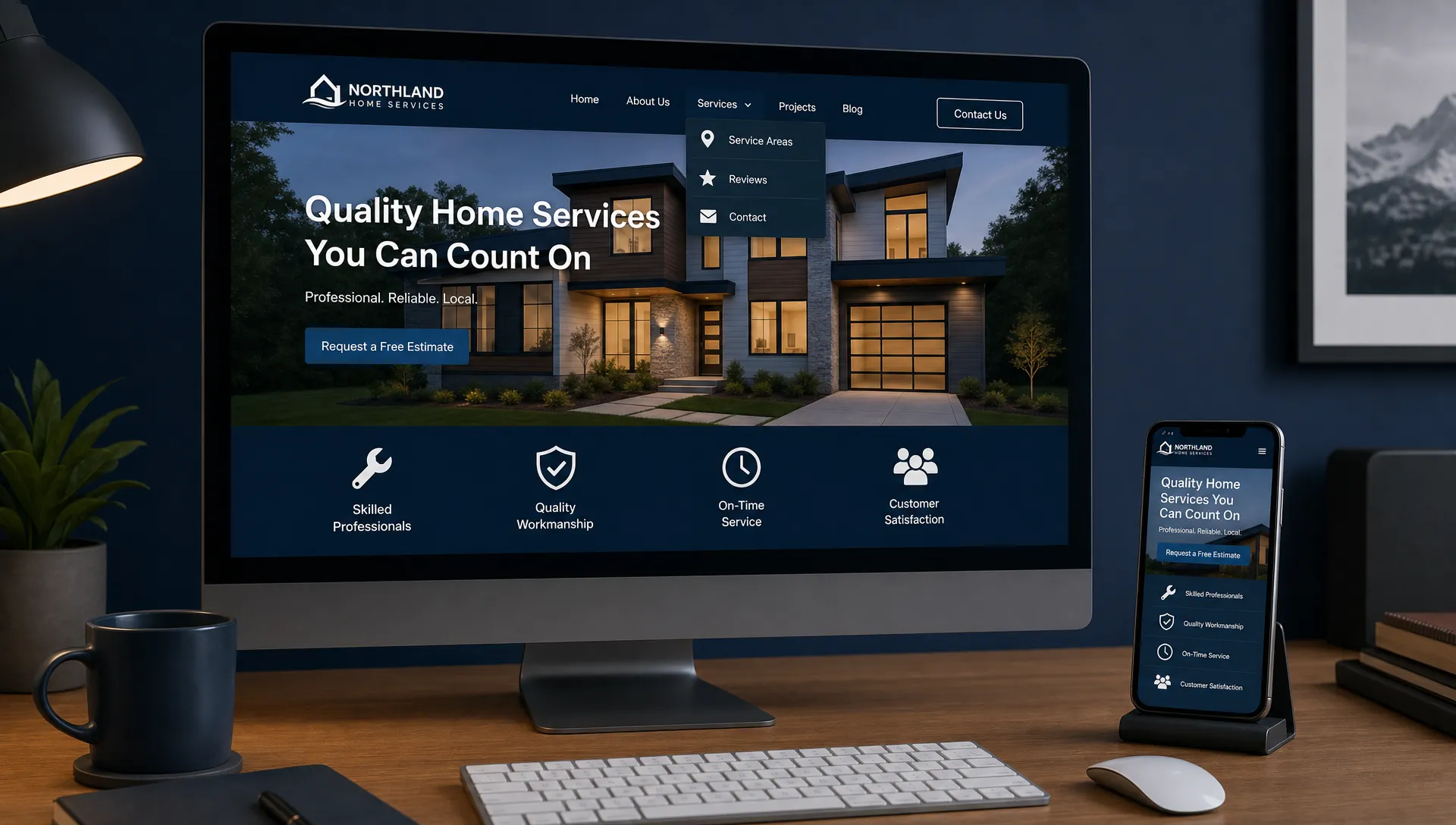
If you offer several services, a dropdown can work, but it should stay organized. Long dropdowns with twenty links are hard to use, especially on mobile. Group related services only if the grouping helps the visitor choose faster.
For many businesses, individual service pages are also important for SEO. A page focused on one service can answer more specific questions and attract visitors who are searching for that exact need. Sleek Web Designs covers this connection between structure and lead generation in its guide to SEO and web design services that turn visits into leads.
Give local visitors a reason to stay
If you serve specific neighborhoods, cities or counties, make that obvious. A visitor should not have to call just to ask, “Do you come to my area?”
A “Service Areas” page can help, but location signals should also appear throughout the site. Mention your main market on the homepage, service pages and contact page. If Google Business Profile and Google Maps visibility matter to your business, keep your website information consistent with your business listing.
For Brooklyn and NYC area businesses, local clarity can be the difference between a qualified call and a wasted visit. If someone lands on your site and cannot confirm that you serve their area, they may never become a lead.
Put trust close to the decision point
Reviews, certifications, project photos and case examples should not be hard to find. The menu can include a “Reviews” or “Results” link when trust is a major buying factor.
This is especially useful for higher-ticket services where the visitor needs more confidence before reaching out. Contractors, real estate professionals, cleaning companies and driving schools all benefit from visible proof. If you want to strengthen that part of your site, review the practical trust elements in 5 trust signals that help local visitors choose you.
Make the action obvious
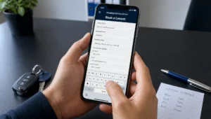
Every page needs a clear next step, but the main navigation should also make action easy. A phone number, “Request a Quote,” “Book a Lesson” or “Schedule a Call” button should be visible without forcing the visitor to search.
Do not use a vague call to action if the visitor is ready to act. “Get Started” can work in some cases, but “Call Now,” “Book a Lesson” or “Request an Estimate” is usually stronger for local service businesses.
Mobile Navigation Is Where Many Leads Are Won or Lost
A mobile responsive website is not just one that shrinks to fit a phone. It must be easy to use with one hand, on a small screen, by someone who may be comparing several businesses quickly.
Your mobile menu should open cleanly, show the most important links first and make the phone number or booking action easy to reach. If visitors have to tap three times just to find your contact page, you are losing leads.
For local service businesses, mobile visitors often have stronger intent. They may be standing near a broken appliance, looking for a same-week driving lesson or trying to schedule a home service during a lunch break. Fast access to services, location information and contact options matters more than clever design.
A sticky call button can work well when calls are a primary lead source, but it should not block the page or compete with the menu. The goal is to help visitors act, not pressure them.
Common Navigation Mistakes That Cost Small Businesses Leads
Most navigation problems are not dramatic. They are small choices that create confusion. The good news is that many can be fixed without a full website redesign.
| Mistake | Why it hurts | Better approach |
|---|---|---|
| Too many menu items | Visitors slow down and miss the important pages | Keep the main menu focused on services, proof, location and contact |
| Vague labels | People do not know where to click | Use plain service names and direct actions |
| Hidden contact options | Ready buyers have to work too hard | Show a phone number, contact button or booking link clearly |
| No service area link | Local visitors cannot confirm fit | Add service area information in the menu or footer |
| Desktop-only thinking | Mobile users struggle with dropdowns and tiny links | Test the menu on real phones before publishing |
| Overloaded dropdowns | Important services get buried | Group services logically or create a clean services hub |
A useful test is to hand your phone to someone who does not know your business and ask them to complete one task. For example, “Find out if we offer emergency repair in your area and request service.” If they hesitate, backtrack or ask you where to tap, your navigation needs work.
How Navigation Supports Local SEO
Navigation is not only for human visitors. It also helps search engines understand which pages matter most. Google Search Central explains that clear, crawlable links help Google discover pages, which is one reason your important service pages should not be hidden behind confusing scripts or buried deep in the site.
For a local service business, the main navigation should support your SEO priorities. If “HVAC repair,” “driving lessons,” “commercial cleaning” or “roof replacement” is a key service, that service should have a clear page and a reasonable path from the menu.
This does not mean stuffing keywords into every label. A menu that says “Best Affordable Brooklyn Roof Repair Contractor Near Me” looks spammy and hurts trust. A clean label like “Roof Repair” is better for visitors and still gives search engines a clear signal.
Internal links also matter. Service pages should connect naturally to related location pages, proof sections and contact options. If you are improving a landing page tied to a specific campaign, the same principle applies. The page should guide visitors toward action, which is why landing page optimization and navigation often work together.
Use AI to Find Navigation Problems Without Overcomplicating It
AI can be useful for navigation, but not as a magic button. The practical value is pattern spotting. It can help review page titles, menu labels, call to action wording, common customer questions and website audit notes to find where visitors may be getting stuck.
For example, if your contact form gets few submissions but your service pages get traffic, AI can help compare the wording and structure across those pages. If your Google Search Console queries show people looking for a specific service, but that service is not easy to find in the menu, that is a clear fix.
AI can also help simplify labels. Business owners often describe services in industry language. Customers search and scan in plain language. Asking AI to rewrite menu labels for clarity can be useful, as long as a real person checks the final choices against customer behavior and local search intent.
The point is not to turn your website into a complicated AI project. The point is to use AI-assisted analysis to make faster, better decisions about what visitors need to see.
A Simple Navigation Checklist for Service Businesses
Before you spend money on a custom website or website redesign, review your current navigation with a lead generation mindset. Ask whether the menu helps a stranger become a customer.
- Can a visitor identify your main services in under five seconds?
- Is your phone number, quote button or booking option visible on desktop and mobile?
- Are your service areas easy to find?
- Do your menu labels use customer language instead of internal terms?
- Are reviews, results or trust signals close to the decision path?
- Can visitors reach key service pages within one or two clicks?
- Does the mobile menu feel simple on a real phone?
- Are low-priority pages moved to the footer instead of crowding the main menu?
- Does every major service page offer a clear next step?
If you answer “no” to several of these, navigation may be one of the easiest ways to improve conversions without rebuilding everything.
When to Fix Navigation and When to Redesign the Site
Not every navigation issue requires a full redesign. If your site is reasonably fast, mobile friendly and built on a stable platform, you may only need a clearer menu, stronger service page structure and better calls to action.
A redesign makes more sense when the site has deeper problems. Slow load times, outdated mobile layouts, confusing page structure, weak service pages and poor local SEO often need a broader fix. In that case, navigation should be part of a larger plan to turn the website into a lead-generating system.
The key is to avoid redesigning for looks alone. A prettier website with the same confusing menu will still leak leads. Better navigation should be tied to measurable business outcomes: more calls, more forms, better-qualified inquiries and stronger local visibility.
For small businesses, the right approach is usually simple. Fix what blocks action first. Then improve the pages that support the highest-value leads.
Frequently Asked Questions
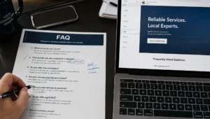
How many items should a small business website menu have? Most service businesses do well with four to six main items. Focus on services, service areas, proof, about information and contact options.
Should every service be in the main navigation? Not always. Your highest-priority services should be easy to reach, but smaller services can live under a clear services hub or supporting pages.
Is a dropdown menu bad for conversions? A dropdown is fine when it is short and organized. It becomes a problem when it hides important pages or feels difficult to use on mobile.
Should my phone number be in the navigation? If calls are important to your business, yes. A visible phone number or call button can reduce friction for visitors who are ready to act.
Can better navigation improve local SEO? Yes. Clear navigation helps search engines discover key service and location pages, and it helps visitors find the information they need to contact you.
Make Your Website Easier to Use and Easier to Hire
If visitors are reaching your site but not becoming leads, your navigation may be part of the problem. Sleek Web Designs helps small businesses simplify their websites, improve local SEO and turn traffic into real calls, bookings and quote requests.
We focus on what moves the business forward: clear structure, better service pages, mobile-friendly navigation and practical AI-assisted analysis. No bloated process. No long-term contracts.
If your website should be bringing in more customers, contact Sleek Web Designs and let’s find the fastest path to better leads.