
Most small business websites don’t have a traffic problem, they have a first-screen problem.
If someone lands on your site and the above-the-fold area (what they see before scrolling) doesn’t immediately answer:
- What do you do?
- Who is it for (and where)?
- Why should I trust you?
- What should I do next?
…your form submissions will stay low, even if the rest of the page is “nice.”
Below are practical, above-the-fold fixes that increase form submissions for local, service-based businesses (HVAC, plumbers, contractors, driving schools, cleaning companies, nonprofits, and similar). No fluff, just what moves the needle.
Why above-the-fold changes can lift form submissions fast
When a visitor arrives, they’re making a quick decision: “Am I in the right place?” If your first screen is vague, slow, or distracting, they bounce or they scroll aimlessly and never convert.
Two realities matter here:
- Mobile is the default. Most local service searches happen on phones, and your above-the-fold on mobile is often a totally different experience than desktop.
- Speed is part of conversion. Google has cited that as page load time increases from 1 second to 3 seconds, the probability of bounce rises significantly (Think with Google). A slow hero section often kills conversions before your offer even loads.
Above-the-fold fixes are usually the fastest path to more leads because they reduce confusion and friction right at the decision point.
The “first screen” goal: one job, one action
Your above-the-fold section should do one job: move a qualified visitor into the next step.
That next step might be:
- Submit a form
- Tap to call
- Book an appointment (if you use scheduling)
If the first screen tries to do three things, it usually does none.
Above-the-fold fixes that increase form submissions
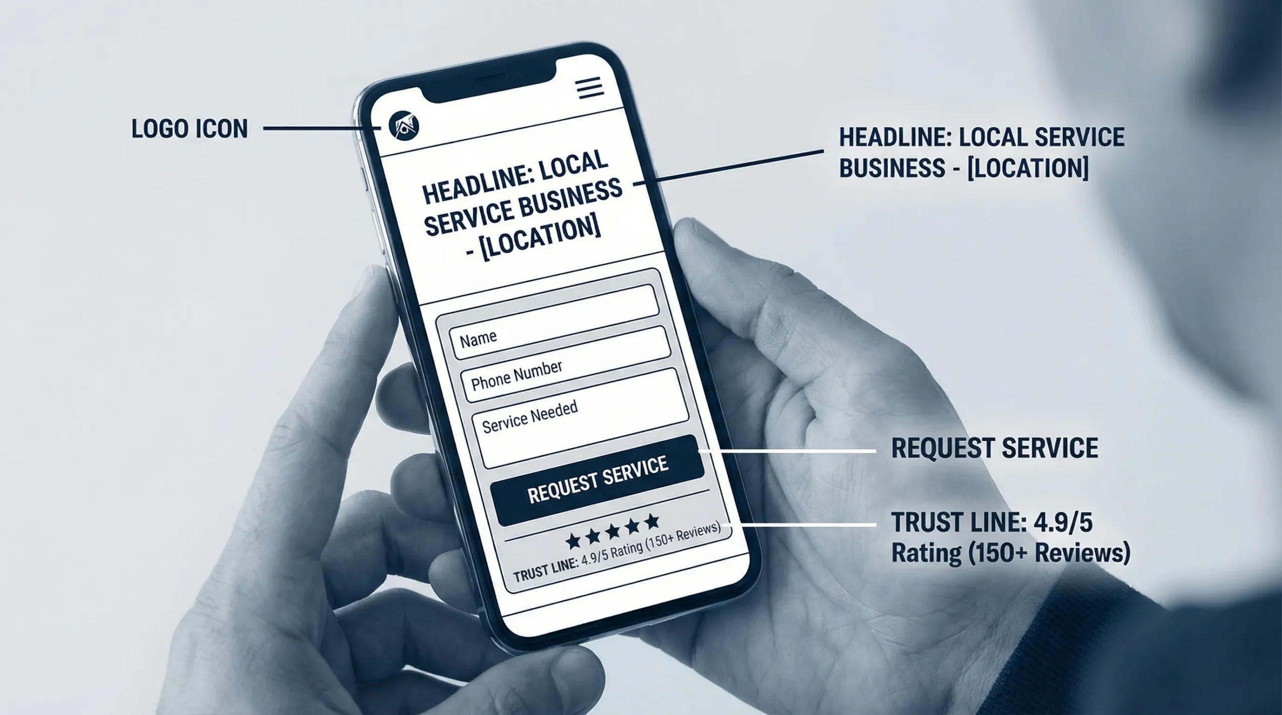
1) Replace clever headlines with a clear service + location promise
If your headline could fit any business, it won’t convert.
A high-converting above-the-fold headline usually includes:
- The service category (what you actually do)
- The local area (where you do it)
- The outcome (what they get)
Examples (adapt to your business):
- “Brooklyn Driving Lessons That Help You Pass Your Road Test”
- “24/7 HVAC Repair in Brooklyn, Fast Response, Licensed Techs”
- “House Cleaning in NYC, Get a Quote in 60 Seconds”
Keep it human. No slogans. No “solutions.”
2) Make the primary CTA impossible to miss (and remove competing CTAs)
Most above-the-fold sections fail because they have:
- Too many buttons (Learn More, Our Services, View Portfolio, Contact, Get Started)
- A CTA that blends into the design
- A CTA that is vague (“Submit”, “Send”, “Click Here”)
Pick one primary CTA and design the whole first screen around it.
Good CTA examples for form-driven pages:
- “Get a Quote”
- “Request a Call Back”
- “Check Availability”
Then add one secondary option, only if it matters:
- “Call Now” (especially for emergency services)
3) Put a short “micro-form” above the fold (not a full intake form)
If your goal is more form submissions, the first form should feel easy.
For most service businesses, a micro-form is enough to start the conversation:
- Name
- Phone or email
- Service needed (dropdown)
- ZIP code (optional, but helpful)
Everything else can happen after you respond.
If you’re currently asking for 8 to 12 fields above the fold, you are making prospects do your admin work before they even trust you.
4) Add “what happens next” copy directly under the CTA
This is one of the highest-leverage fixes because it removes uncertainty.
Right below your button or form, add a simple expectation line:
- “We’ll call you within 15 minutes during business hours.”
- “Get a same-day estimate. No obligation.”
- “Tell us your area and we’ll confirm availability.”
If you cannot commit to a time, keep it honest:
- “We respond within 1 business day.”
Clarity beats aggressive promises.
5) Show trust fast: reviews, proof, and local credibility
You don’t need a wall of badges. You need one tight trust block that matches how people decide.
Above-the-fold trust signals that usually help form submissions:
- Star rating with review count (if accurate)
- “Licensed and insured” (only if true)
- Local service area line (city, neighborhoods)
- A simple “Trusted by local homeowners” style line if you can back it up
Even one small proof element near the form can reduce hesitation.
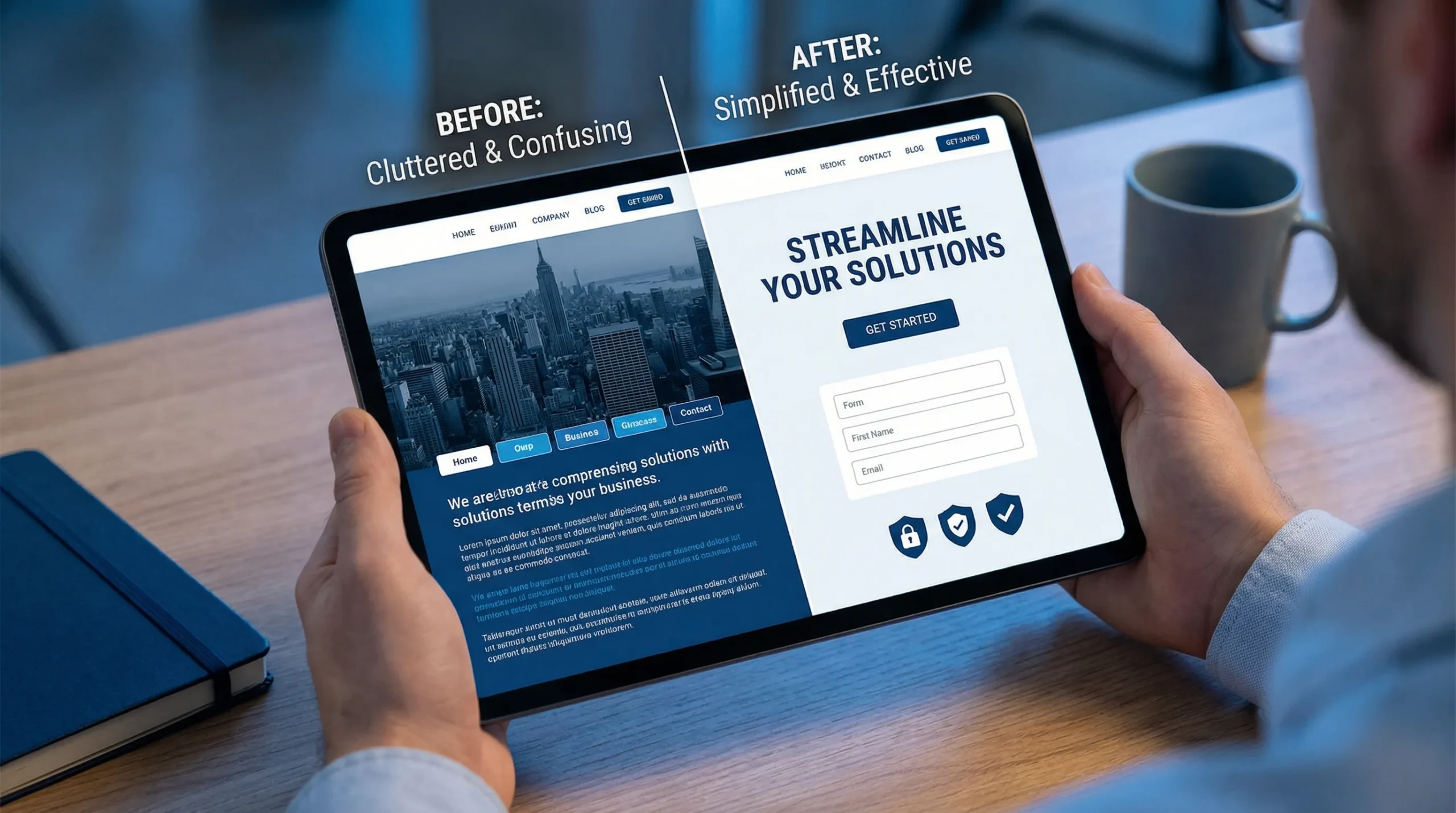
6) Stop using slider heroes (and stop hiding the offer)
Sliders distract, slow the page, and dilute your message.
Your above-the-fold should have:
- One message
- One visual that supports the message
- One primary action
If you want to show multiple services, do it below the fold with a clean grid.
7) Fix mobile above-the-fold spacing so the CTA stays visible
A common mobile conversion killer:
- Huge header
- Giant hero image
- Big padding
Result: the CTA and/or form is below the fold, so people have to scroll to take action.
What to do instead:
- Reduce top padding on mobile
- Keep the headline to 1 to 2 lines
- Use a shorter hero image (or none)
- Keep the CTA button and the first 2 fields visible
If your CTA is not visible on most phones without scrolling, you’re paying a conversion tax.
8) Speed up the first screen (because your form can’t convert if it doesn’t load)
Above-the-fold speed is mostly about removing what blocks the first render.
High-impact fixes that often help immediately:
- Compress and resize the hero image (don’t load a 4000px photo for a 390px phone screen)
- Use modern image formats (WebP/AVIF where supported)
- Limit custom font files and weights
- Delay non-essential scripts (chat widgets, heavy trackers) until after interaction
If you want a simple benchmark, use Google’s PageSpeed Insights and focus on the items that mention render blocking or above-the-fold.
9) Make form fields easier to complete (small UX changes, big lift)
Most forms lose submissions because they’re annoying, not because the offer is bad.
Above-the-fold form improvements:
- Labels above fields (not placeholder-only)
- Correct input types (tel for phone, email for email)
- Autofill enabled
- Clear error messages (and don’t wipe the form on error)
- One column layout
Also, the submit button should say what happens:
- “Request My Quote” is better than “Submit”
10) Match the first screen to the traffic source (especially local search)
If someone searches “Brooklyn boiler repair” and lands on a page that says “Quality Home Services,” your conversions will be weak.
Match above-the-fold messaging to:
- The keyword intent (repair vs install vs maintenance)
- The location (city, borough, neighborhoods)
- The promise in your Google Business Profile or ad copy
This is also where content marketing ties in.
For example, if you publish troubleshooting content that attracts high-intent visitors, the next step is making sure your service page’s first screen continues the same “helpful and specific” tone. A good example of what that practical, problem-first content looks like is this appliance repair troubleshooting blog, which focuses on specific issues people actually search.
A quick “above-the-fold” checklist (use this to audit your own site)
Open your homepage (and your main service page) on your phone. Without scrolling, answer these:
- Can I tell what you do in 3 seconds?
- Can I tell who you serve (location) in 3 seconds?
- Is there one obvious next step (CTA) without scrolling?
- Does the page load fast enough that the CTA appears quickly?
- Is there at least one trust signal near the CTA?
- Is the form short and easy to complete?
If any answer is “no,” that’s your first fix.
Common above-the-fold problems (and the fix that usually works)
| Above-the-fold problem | What it looks like | Fix that usually increases form submissions |
|---|---|---|
| Vague headline | “Welcome to our website” | Rewrite as service + location + outcome |
| CTA below the fold | Button hidden under a big image | Reduce hero height, move CTA up |
| Too many choices | 5 to 8 buttons/links | One primary CTA, one secondary max |
| Long form upfront | 8+ required fields | Micro-form now, details later |
| No trust | No reviews, no proof | Add rating, service area, credibility line |
| Slow first load | Heavy hero image, scripts | Compress images, delay scripts, simplify fonts |
Simple above-the-fold layouts that work (steal these)
You do not need a “creative” hero. You need a layout that makes action easy.
Layout A: The “fast quote” hero (best for most service businesses)
- Headline: service + location
- Subheadline: 1 sentence, outcome-focused
- Micro-form: 3 to 4 fields
- Trust: rating or short proof line under the button
Layout B: The “call-first” hero (best for urgent services)
- Headline: emergency service + location
- Primary CTA: Call Now (large, tap-friendly)
- Secondary CTA: short form (“Request a call back”)
- Trust: licensing and reviews (only if true)
Layout C: The “driving school” hero (best when confidence and clarity matter)
- Headline: “Driving Lessons in [Area]” + outcome (pass the test)
- CTA: “Check Lesson Availability”
- Proof: “Hundreds of students trained” (only if true) or review rating
- Small clarity line: “Packages available, learn at your pace” (keep it real)
Where AI actually helps (without turning this into hype)
AI won’t magically increase conversions, but it can help you spot what’s unclear.
Here are practical, low-drama ways small businesses use AI for above-the-fold improvements:
- Headline testing ideas: Generate 10 headline options, then pick the 2 to 3 that are most specific and least fluffy.
- Clarity checks: Ask AI, “What does this business do and who is it for based on this hero section?” If the answer is wrong or vague, your visitors feel the same.
- Pattern finding from reviews: Paste a handful of real customer reviews and ask AI to summarize the top 3 reasons people choose you. Use that language in the subheadline and trust line.
AI is best as a shortcut for drafts and analysis. The final copy still needs to be true, specific, and local.
The fastest way to get results: test, don’t guess
You don’t need a full website redesign to increase form submissions. Start by improving the first screen, then measure the difference.
A simple, practical testing approach:
- Take a baseline: current weekly form submissions
- Change one above-the-fold element (headline, CTA placement, form length)
- Run it for 2 to 3 weeks (or until you have enough traffic to see a pattern)
- Keep what works, then move to the next item
Even without fancy tools, you can track form submissions in analytics and compare before and after.
If you want more form submissions, fix the first screen first
At Sleek Web Designs, we focus on turning websites into lead systems for local service businesses. That usually starts with above-the-fold clarity, speed, and a conversion path that makes sense.
If you want an outside set of eyes on what’s costing you leads, start with a focused audit and action plan, not a long contract. You can also see how we approach conversion-focused builds and optimization in our post on SEO and web design services that turn visits into leads.