Website accessibility fixes can remove the barriers that stop visitors from calling, requesting a quote or booking a service. A contact form without clear labels, a menu that cannot be used with a keyboard or a button that disappears against its background can cost you a potential customer, regardless of how polished your website looks.
For a local service business, accessibility belongs in the same conversation as lead generation. These six fixes focus on helping more people complete the actions that matter to your business.
Accessibility should support calls, forms and bookings
Accessibility means making your website usable by people with different disabilities, including people who use screen readers, keyboard navigation or magnification. Many of the same improvements also help someone browsing in bright sunlight or using a phone with one hand.
Start with your main customer journey: finding a service, checking your location and contacting your business. Fix barriers along that path before spending time on decorative changes.
The W3C’s Web Content Accessibility Guidelines, known as WCAG, provide a useful reference. The recommendations below address common issues, but they are not a complete accessibility audit or a guarantee of legal compliance.
Accessibility is not a guaranteed Google ranking boost. Local SEO helps people find you; an accessible website helps them take the next step once they arrive.
1. Make important text and buttons easy to see
Light gray text on a white background may fit your branding, but it can make service details, phone numbers and form instructions difficult to read. The same problem affects buttons whose labels barely stand out from their background.
Check the information visitors need before contacting you: service descriptions, service areas, pricing explanations, contact details and booking instructions. Do not limit your review to the homepage headline.
WCAG’s minimum text contrast guidance calls for a contrast ratio of at least 4.5:1 for most text and 3:1 for qualifying large text. A contrast checker can compare your text and background colors without guesswork.
Also check links and form errors. A red outline alone does not explain what went wrong, and a link distinguished only by color can be missed. Use a written error message and a visible link treatment, such as an underline.
Conversion benefit: Visitors can read your offer and recognize the next step without struggling to identify it.
2. Make navigation work without a mouse
Some visitors navigate with a keyboard rather than a mouse. If they cannot reach your services, open your menu or activate your contact button, your website has a blocked customer journey.
These website accessibility fixes are easy to start testing yourself. Open your website and put the mouse aside:
- Press Tab to move through links, buttons and form fields, then Shift+Tab to move backward.
- Look for a visible outline or other clear indicator showing which item has focus.
- Use Enter to activate links and Enter or Space for standard buttons.
- Check that menus and pop-ups can be operated and closed without trapping keyboard focus.
The order should follow the page logically. A visitor should not jump from the header to the footer before reaching the quote form. Sticky banners should not cover the focused item.
For local businesses, keep the route to services and contact information straightforward. These principles work alongside small business website navigation that helps visitors convert, but clear menu wording cannot compensate for controls someone cannot operate.
Conversion benefit: More visitors can reach and use your contact options independently.
3. Give forms clear labels and useful error messages
A form can look simple and still be difficult to use. Placeholder text disappears when someone starts typing, and it does not reliably replace a properly connected field label.
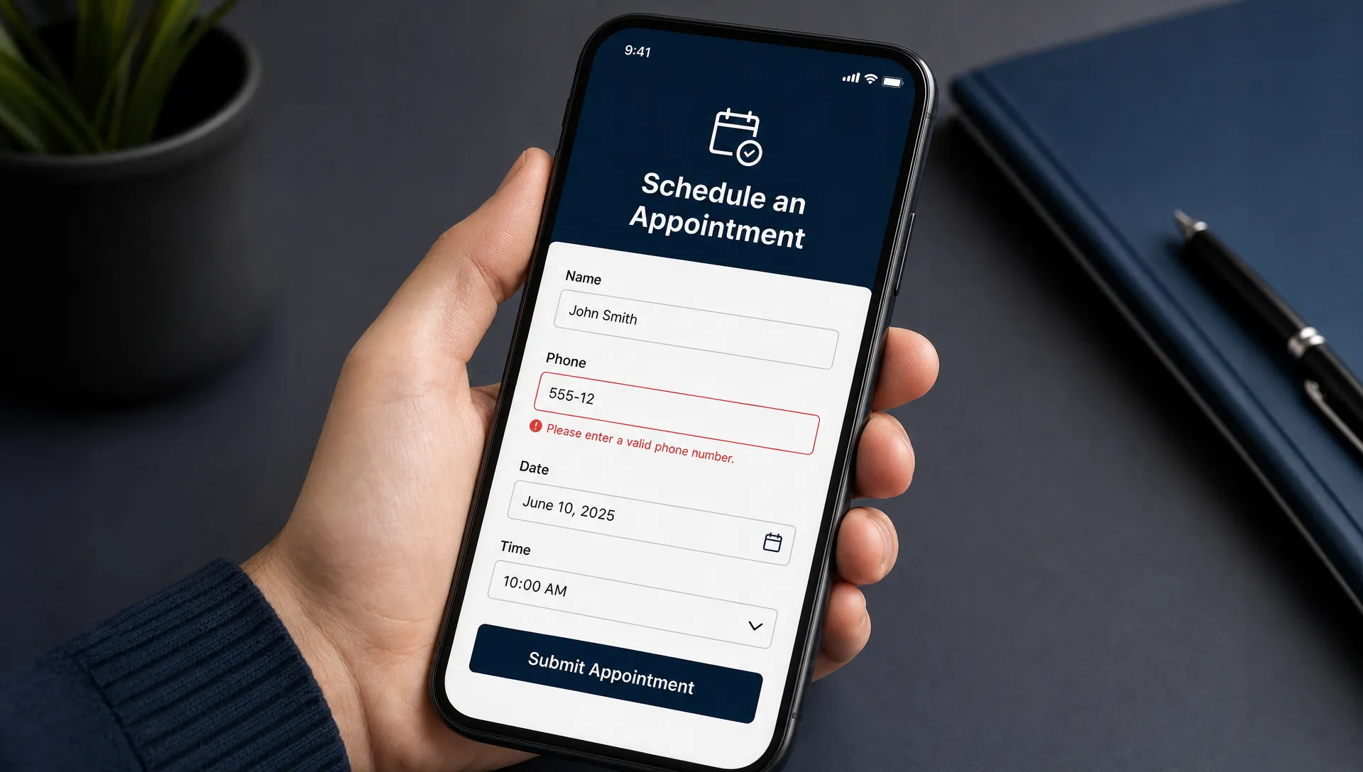
Every field should have a visible label that your developer connects to the input. Identify required fields before submission and explain any expected format, such as the date format for a preferred appointment.
When something goes wrong, explain the problem beside the relevant field. “Please enter a phone number” is more useful than “Invalid input.” Keep information already entered so visitors do not have to start again.
For appointment-based businesses, the stakes are practical. Someone visiting Gentle Dental Geelong may want to explore treatments, book an appointment or contact the practice. On any dental or healthcare website, the booking path should let visitors complete those tasks without unclear fields or inaccessible controls.
Test the confirmation message too. Visitors need to know their request was submitted, and screen reader users should receive that update without having to search the page.
Conversion benefit: Clear labels and recoverable errors can reduce abandoned inquiries and unnecessary calls asking whether a request went through.
4. Support mobile use, zoom and comfortable tap targets
A mobile-responsive website is a starting point, not proof of accessibility. Text may still become unreadable when enlarged, buttons may overlap or a booking widget may require awkward sideways scrolling.
Test your important pages on a phone and at 200% browser zoom on a computer. Check whether the menu, contact form and call button remain usable. Ask your developer to test narrow layouts and higher magnification as well, particularly if your booking system comes from another provider.
Make buttons large enough to tap comfortably and give neighboring controls enough space. WCAG 2.2 includes a 24-by-24 CSS pixel minimum target-size requirement with exceptions, including spacing provisions. For prominent call and booking buttons, a practical design goal is around 44-by-44 CSS pixels or larger.
Website accessibility fixes also need to account for sticky elements. A floating call button should not hide the form’s submit button, and a chat widget should not cover an error message.
Conversion benefit: People can complete the contact process on the device they already have in their hand, without zooming back and forth or tapping the wrong control.
5. Use specific links and recognizable contact buttons
Repeated links labeled “Learn more” make visitors work harder to understand where they lead. That problem becomes more noticeable when a screen reader user reviews a list of links outside the surrounding paragraph.
Use wording that describes the destination or action. “View HVAC repair services,” “Request a cleaning quote” and “Book a driving lesson” communicate more than “Click here.” Keep the wording concise rather than packing keywords into every link.
Buttons also need accessible names that match what visitors see. A phone icon without a text label may be unclear to a screen reader user, while a mismatched label can create problems for someone using voice control.
For the main contact action, visible text is usually the simplest choice. Display a readable phone number and make it tappable on mobile. If a button opens an external booking service, say so when that helps visitors understand what will happen.
Conversion benefit: Visitors can choose the right action with less uncertainty, whether they are reading, listening or using voice commands.
6. Organize service information with headings and useful image descriptions
A page that looks organized is not necessarily organized in its code. Large, bold text may look like a heading without functioning as one for assistive technology.
Use proper headings to structure your service pages. A visitor should be able to find the service description, service area, relevant qualifications and contact options without listening to the entire page. Keep heading levels logical rather than choosing them solely for font size.
Keep essential information as real text. Your phone number, opening hours and service area should not exist only inside an image or graphic. This also gives search engines clearer access to the information, though it does not guarantee rankings.
For informative images, write alternative text that communicates their purpose. A project photo might describe the relevant work shown. Decorative images generally need empty alternative text so screen readers skip them. A linked image needs an accessible description of its destination or function.
These website accessibility fixes should clarify the page, not turn image descriptions into a list of local SEO keywords.
Conversion benefit: Visitors can find the details they need to decide whether your business is a good fit.
Measure whether website accessibility fixes improve conversions
Start with the pages that receive local search traffic and the actions that generate customers. For an HVAC business, that might be the repair page and quote form. For a driving school, it might be the lesson page and booking process.
Track completed actions rather than assuming every button click represents a lead.
| Measure | What it helps you understand |
|---|---|
| Form starts and successful submissions | Whether visitors are getting through the inquiry process |
| Booking starts and confirmed bookings | Whether the appointment path has remaining barriers |
| Phone-link clicks | Whether visitors are selecting the call option, not whether a call was completed |
| Qualified inquiries | Whether website activity is producing relevant potential customers |
Compare results across similar periods and account for changes in traffic, advertising and seasonality. A small website may not have enough activity to attribute a conversion change confidently to one fix.
Accessibility is worth improving even when a short-term conversion increase is not measurable. Use these checks alongside your broader conversion rate optimization strategy, not as a replacement for evaluating lead quality.
Automated checks can identify some issues. AI can help draft clearer labels or alternative text, but someone must verify accuracy and context. Neither replaces keyboard testing or a skilled accessibility review.
Frequently Asked Questions
Do I need a full website redesign to fix accessibility problems? Often, no. Contrast, labels, button wording and some navigation issues can be corrected within an existing website. Problems built into the theme or booking system may require more substantial changes. Audit the customer journey before deciding on a redesign.
Can a WordPress plugin make my website accessible? A plugin may help identify or address specific issues, but installing one does not prove accessibility. Check your WordPress theme, forms and third-party booking tools, then test the complete contact process manually.
Will these changes improve my local Google rankings? There is no guaranteed ranking increase. Clear page structure and readable service information can support your website’s usability and on-page SEO, while Google Business Profile optimization remains a separate part of local visibility.
Which fix should I handle first? Fix anything that prevents someone from contacting you: an unusable menu, an inaccessible form or a hidden booking button. Then address barriers that make the journey harder, such as weak contrast and unclear links.
Make your website easier to use and easier to contact
Your website should help potential customers reach you, not make them work around avoidable barriers. Start with one high-value service page and test the full path from arrival to a confirmed inquiry.
Sleek Web Designs offers website audits, conversion-focused optimization and local SEO for service businesses, with practical AI-assisted analysis and no long-term contracts. Talk with Sleek Web Designs about your website to identify what is getting in the way of calls, bookings and qualified leads.